
Typographic system
Clear, confident and unmistakably HSA.
Euclid Circular A · Semibold / Regular
Primary Latin
Euclid Circular A. Use Semibold for headlines and Regular for body copy. Keep tracking at zero and use metrics kerning.
Arabic and web
The manual lists Aktiv Grotesk for primary Arabic, Jost for web Latin, and Cairo for web Arabic. Use the source pages below to check the complete hierarchy.
System fallback
Arial is the Latin and Arabic system-safe fallback when primary typefaces are unavailable. Use Regular and Bold.
Layout relationships
Headline leading is the font size plus 2 points. In the prescribed collateral grid, body copy is 15% of the maximum headline size, rounded up. For interfaces, prioritise readable text at every screen size.
Explore the original manual 16 pages · May 2022
Original chapter pages, including all diagrams and examples. PDF page numbers are used below; printed page numbers differ after the first chapter. Historic application examples retain their original wording.
Read page text
H SA G RO U P B R A N D A N D ST Y L E G U I D E                                                                                                                                                                                                                                                                                                                        3 3

7    Typographic
     system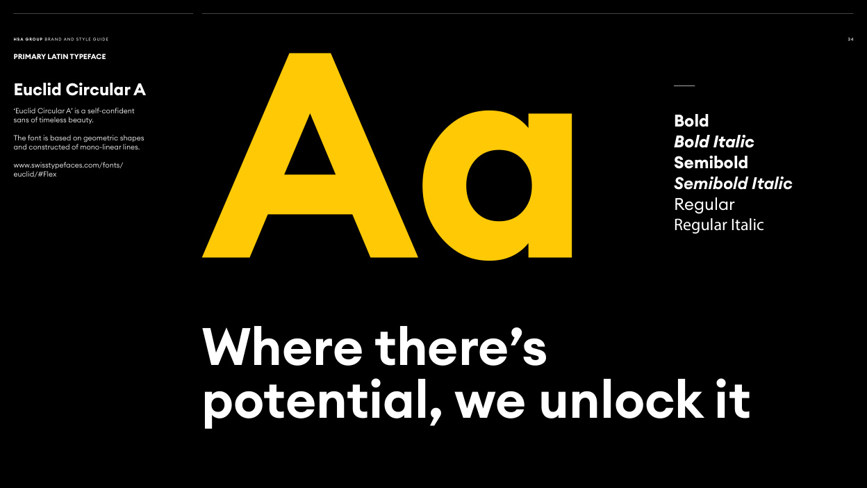
Read page text
H SA G RO U P B R A N D A N D ST Y L E G U I D E                                                                                                                                                                                                                                                                                                                        3 4

PRIMARY LATIN TYPEFACE

Euclid Circular A

‘Euclid Circular A’ is a self-confident
sans of timeless beauty.                                                                           Bold
The font is based on geometric shapes
and constructed of mono-linear lines.                                                                           Bold Italic

www.swisstypefaces.com/fonts/                                                                       Semibold
euclid/#Flex
                                                                       Semibold Italic
                                                                            Regular
                                                                                       Regular Italic Aa      Where there’s
        potential, we unlock it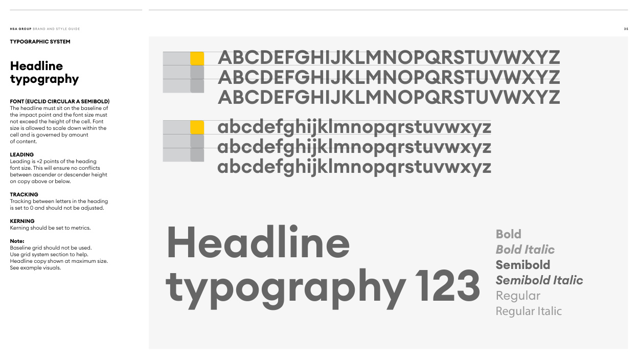
Read page text
H SA G RO U P B R A N D A N D ST Y L E G U I D E                                                                                                                                                                                                                                                                                                                        3 5

TYPOGRAPHIC SYSTEM
                ABCDEFGHIJKLMNOPQRSTUVWXYZHeadline
typography                ABCDEFGHIJKLMNOPQRSTUVWXYZ

FONT (EUCLID CIRCULAR A SEMIBOLD)                ABCDEFGHIJKLMNOPQRSTUVWXYZThe headline must sit on the baseline of
the impact point and the font size must
not exceed the height of the cell. Font
size is allowed to scale down within the
cell and is governed by amount                    abcdefghijklmnopqrstuvwxyz
of content.
LEADING                 abcdefghijklmnopqrstuvwxyz
Leading is +2 points of the heading
font size. This will ensure no conflicts
between ascender or descender height                    abcdefghijklmnopqrstuvwxyz
on copy above or below.

TRACKING
Tracking between letters in the heading
is set to 0 and should not be adjusted.

KERNING
Kerning should be set to metrics.
                                                                           BoldNote:
Baseline grid should not be used.Use grid system section to help.                                                               Bold Italic
Headline copy shown at maximum size.See example visuals.    Headline                                                                       Semibold
                                                                       Semibold Italic
                                                                            Regular      typography 123                                                                                      Regular Italic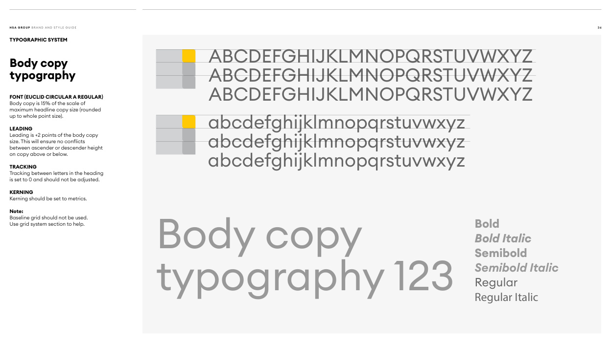
Read page text
H SA G RO U P B R A N D A N D ST Y L E G U I D E                                                                                                                                                                                                                                                                                                                        3 6

TYPOGRAPHIC SYSTEM
                ABCDEFGHIJKLMNOPQRSTUVWXYZBody copy
typography                ABCDEFGHIJKLMNOPQRSTUVWXYZ

FONT (EUCLID CIRCULAR A REGULAR)Body copy is 15% of the scale of          ABCDEFGHIJKLMNOPQRSTUVWXYZ
maximum headline copy size (rounded
up to whole point size).

LEADING                    abcdefghijklmnopqrstuvwxyz
Leading is +2 points of the body copy
size. This will ensure no conflicts
between ascender or descender height                    abcdefghijklmnopqrstuvwxyz
on copy above or below.

TRACKING                    abcdefghijklmnopqrstuvwxyz
Tracking between letters in the heading
is set to 0 and should not be adjusted.

KERNING
Kerning should be set to metrics.

Note:
Baseline grid should not be used.
Use grid system section to help.                                                                           Bold
                                                                           Bold Italic      Body copy                                                                       Semibold
                                                                       Semibold Italic
                                                                            Regular      typography 123                                                                                      Regular Italic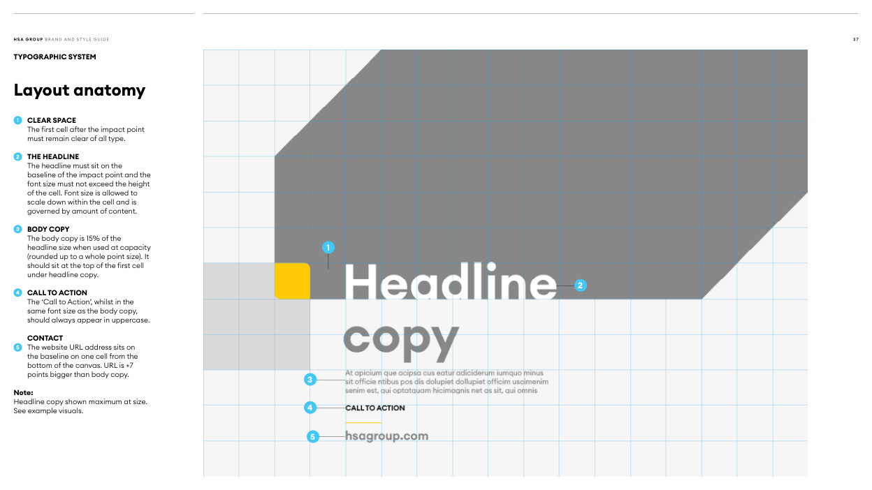
Read page text
H SA G RO U P B R A N D A N D ST Y L E G U I D E                                                                                                                                                                                                                                                                                                                        3 7

TYPOGRAPHIC SYSTEM

Layout anatomy


 1  CLEAR SPACE
   The first cell after the impact point
   must remain clear of all type.

 2  THE HEADLINE
   The headline must sit on the
    baseline of the impact point and the
    font size must not exceed the height
    of the cell. Font size is allowed to
    scale down within the cell and is
   governed by amount of content.

 3  BODY COPY
   The body copy is 15% of the
    headline size when used at capacity                                                        1
    (rounded up to a whole point size). It
    should sit at the top of the first cell
   under headline copy.
                                                                                                                      2
 4  CALL TO ACTION
   The ‘Call to Action’, whilst in the
   same font size as the body copy,
    should always appear in uppercase.

   CONTACT
 5  The website URL address sits on
    the baseline on one cell from the
   bottom of the canvas. URL is +7
    points bigger than body copy.
                                                            3
Note:
Headline copy shown maximum at size.
                                                       4See example visuals.


                                                              5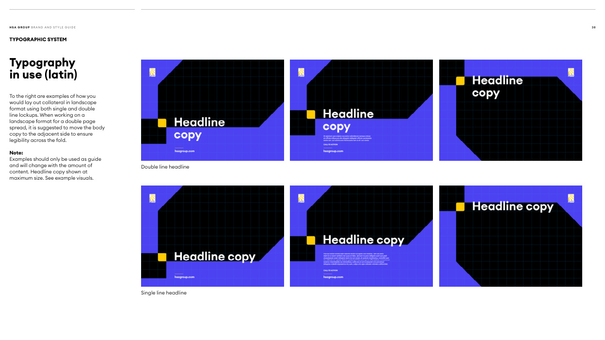
Read page text
H SA G RO U P B R A N D A N D ST Y L E G U I D E                                                                                                                                                                                                                                                                                                                        3 8

TYPOGRAPHIC SYSTEM

Typography
in use (latin)


To the right are examples of how you
would lay out collateral in landscape
format using both single and double
line lockups. When working on a
landscape format for a double page
spread, it is suggested to move the body
copy to the adjacent side to ensure
legibility across the fold.

Note:
Examples should only be used as guide
and will change with the amount of                                               Double line headline
content. Headline copy shown at
maximum size. See example visuals.


                                                        Single line headline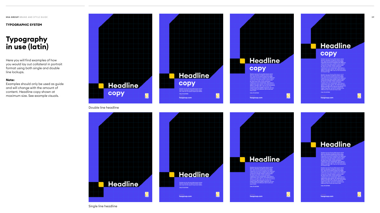
Read page text
H SA G RO U P B R A N D A N D ST Y L E G U I D E                                                                                                                                                                                                                                                                                                                        3 9

TYPOGRAPHIC SYSTEM

Typography
in use (latin)


Here you will find examples of how
you would lay out collateral in portrait
format using both single and double
line lockups.

Note:
Examples should only be used as guide
and will change with the amount of
content. Headline copy shown at
maximum size. See example visuals.


                                               Double line headline


                                                        Single line headline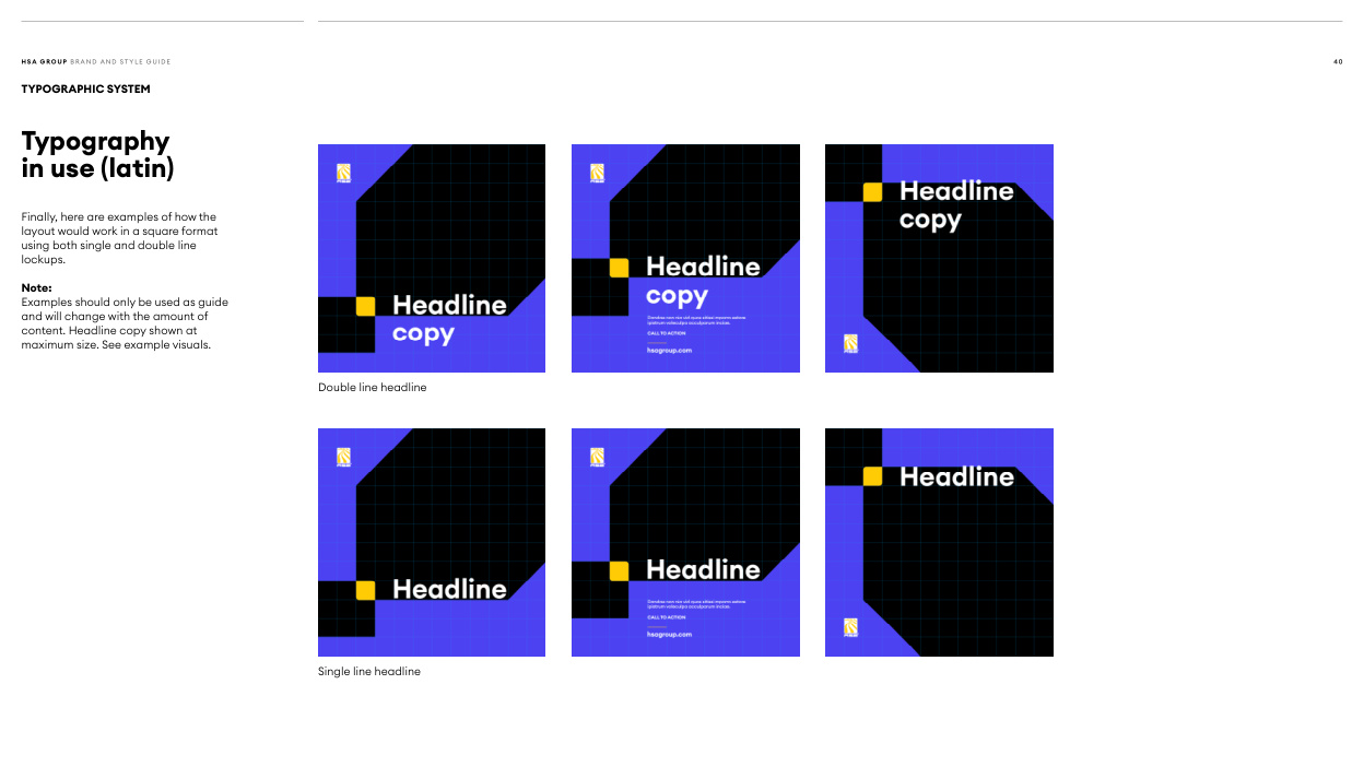
Read page text
H SA G RO U P B R A N D A N D ST Y L E G U I D E                                                                                                                                                                                                                                                                                                   4 0

TYPOGRAPHIC SYSTEM

Typography
in use (latin)


Finally, here are examples of how the
layout would work in a square format
using both single and double line
lockups.

Note:
Examples should only be used as guide
and will change with the amount of
content. Headline copy shown at
maximum size. See example visuals.


                                               Double line headline


                                                        Single line headline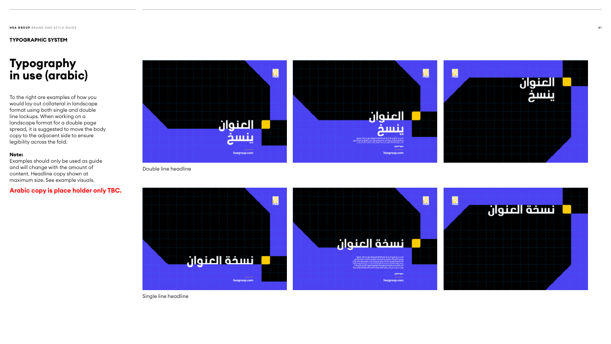
Read page text
H SA G RO U P B R A N D A N D ST Y L E G U I D E                                                                                                                                                                                                                                                                                                                                      41

TYPOGRAPHIC SYSTEM

Typography
in use (arabic)


To the right are examples of how you
would lay out collateral in landscape
format using both single and double
line lockups. When working on a
landscape format for a double page
spread, it is suggested to move the body
copy to the adjacent side to ensure
legibility across the fold.

Note:
Examples should only be used as guide
and will change with the amount of                                               Double line headline
content. Headline copy shown at
maximum size. See example visuals.
Arabic copy is place holder only TBC.


                                                        Single line headline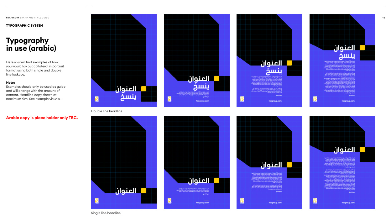
Read page text
H SA G RO U P B R A N D A N D ST Y L E G U I D E                                                                                                                                                                                                                                                                                                   4 2

TYPOGRAPHIC SYSTEM

Typography
in use (arabic)


Here you will find examples of how
you would lay out collateral in portrait
format using both single and double
line lockups.

Note:
Examples should only be used as guide
and will change with the amount of
content. Headline copy shown at
maximum size. See example visuals.


                                               Double line headline
Arabic copy is place holder only TBC.


                                                        Single line headline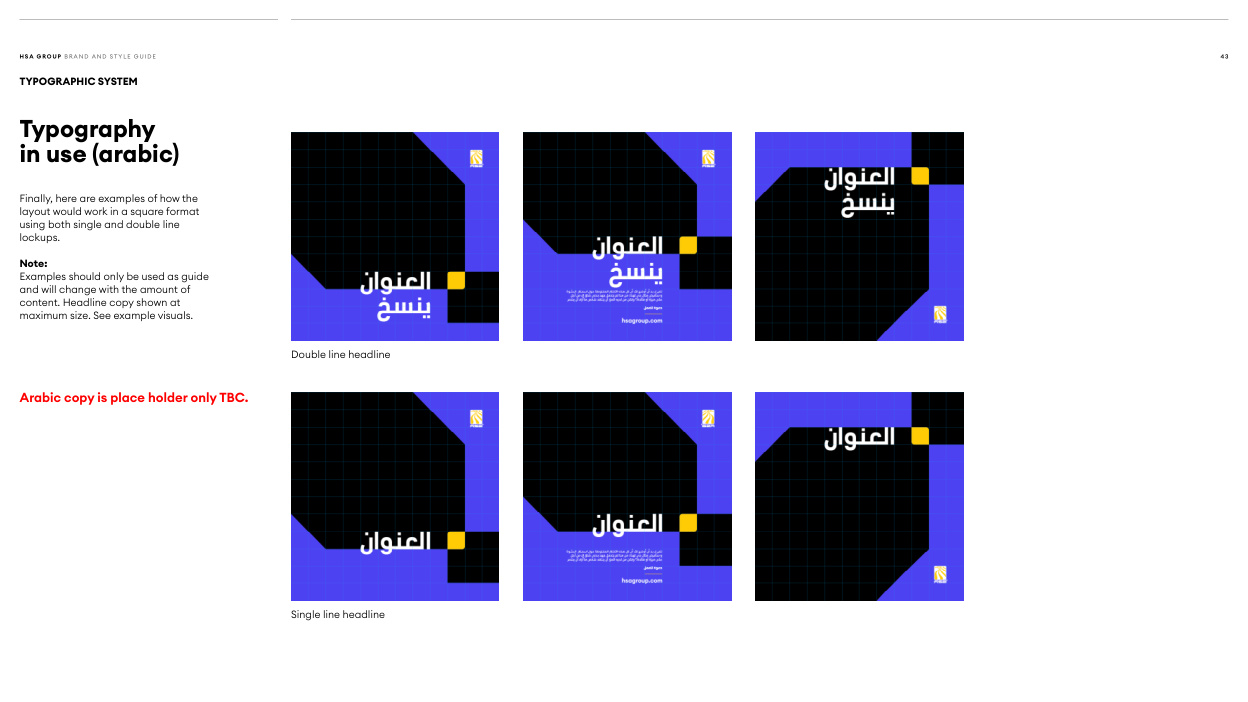
Read page text
H SA G RO U P B R A N D A N D ST Y L E G U I D E                                                                                                                                                                                                                                                                                                   4 3

TYPOGRAPHIC SYSTEM

Typography
in use (arabic)


Finally, here are examples of how the
layout would work in a square format
using both single and double line
lockups.

Note:
Examples should only be used as guide
and will change with the amount of
content. Headline copy shown at
maximum size. See example visuals.


                                               Double line headline


Arabic copy is place holder only TBC.


                                                        Single line headline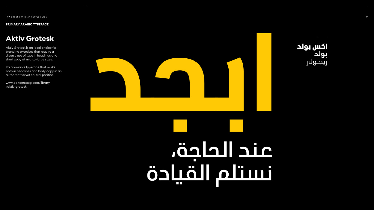
Read page text
H SA G RO U P B R A N D A N D ST Y L E G U I D E                                                                                                                                                                                                                                                                                                   4 4

PRIMARY ARABIC TYPEFACE

Aktiv Grotesk

Aktiv Grotesk is an ideal choice for
branding exercises that require a                                                                                     بولد اكس
diverse use of type in headings and
short copy at mid-to-large sizes.                                                                                              بولد

It’s a variable typeface that works                                                                                                                  ريجيوالر
both in headlines and body copy in an
authoritative yet neutral position.

www.daltonmaag.com/library
/aktiv-grotesk

      ،عندالحاجة
               القيادة نستلم  ابجد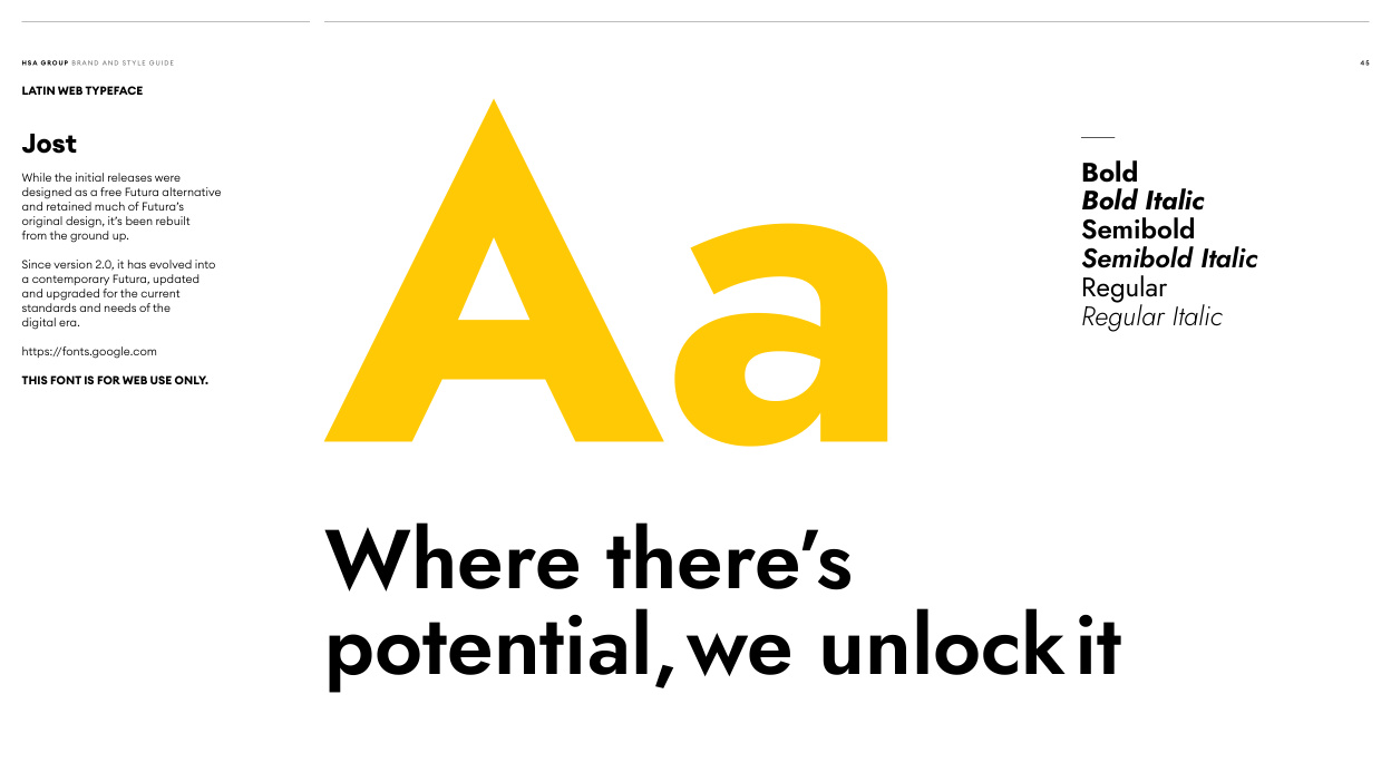
Read page text
H SA G RO U P B R A N D A N D ST Y L E G U I D E                                                                                                                                                                                                                                                                                                   4 5

LATIN WEB TYPEFACE

Jost

While the initial releases were                                                                          Bold
designed as a free Futura alternative
and retained much of Futura’s                                                                            Bold Italic
original design, it’s been rebuilt
from the ground up.                                                                          Semibold

Since version 2.0, it has evolved into                                                                            Semibold Italic
a contemporary Futura, updated
and upgraded for the current                                                                                      Regular
standards and needs of the
digital era.                                                                                         Regular Italic

https://fonts.google.com

THIS FONT IS FOR WEB USE ONLY. Aa      Where there’s
         potential, we unlock it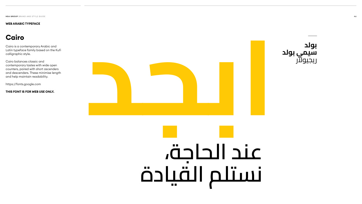
Read page text
H SA G RO U P B R A N D A N D ST Y L E G U I D E                                                                                                                                                                                                                                                                                                   4 6

WEB ARABIC TYPEFACE

Cairo

Cairo is a contemporary Arabic and                                                                                               بولدLatin typeface family based on the Kufi
calligraphic style.                                                                                        بولد سيمي
Cairo balances classic and                                                                                                               ريجيوالرcontemporary tastes with wide open
counters, paired with short ascenders
and descenders. These minimise length
and help maintain readability.

https://fonts.google.com

THIS FONT IS FOR WEB USE ONLY.  ابجد      ،عندالحاجة
               القيادة نستلم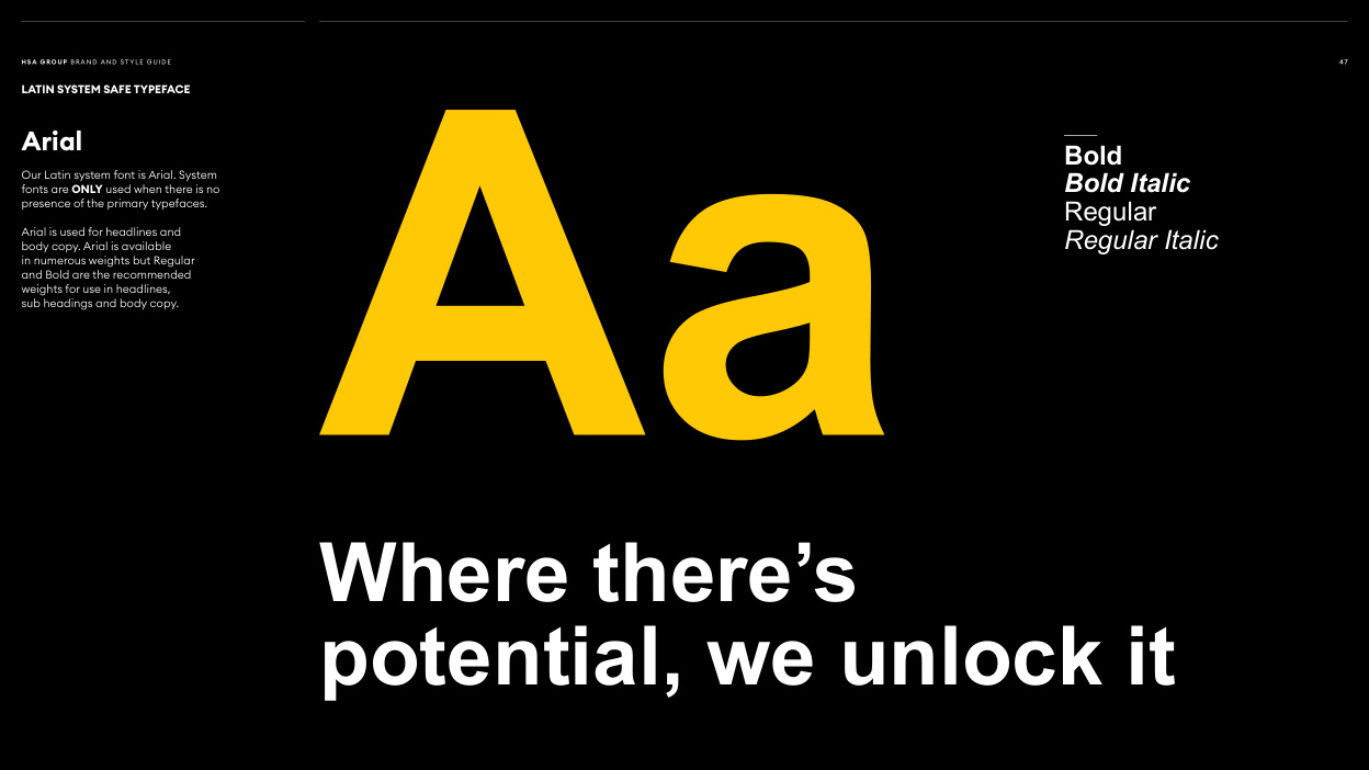
Read page text
H SA G RO U P B R A N D A N D ST Y L E G U I D E                                                                                                                                                                                                                                                                                         47

LATIN SYSTEM SAFE TYPEFACE

Arial                                                                       Bold
Our Latin system font is Arial. System
fonts are ONLY used when there is no                                                                       Bold Italic
presence of the primary typefaces.                                                                 Regular
Arial is used for headlines and
body copy. Arial is available                                                                               Regular Italic
in numerous weights but Regular
and Bold are the recommended
weights for use in headlines,
sub headings and body copy. Aa      Where there’s
        potential, we unlock it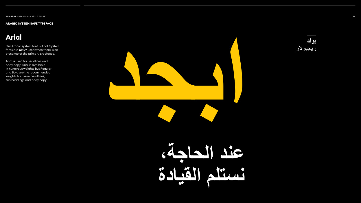
Read page text
H SA G RO U P B R A N D A N D ST Y L E G U I D E                                                                                                                                                                                                                                                                                                   4 8

ARABIC SYSTEM SAFE TYPEFACE

Arial                                                                                                                                     بولد
Our Arabic system font is Arial. System
fonts are ONLY used when there is no                                                                                                                ريجيوالر
presence of the primary typefaces.

Arial is used for headlines and
body copy. Arial is available
in numerous weights but Regular
and Bold are the recommended
weights for use in headlines,
sub headings and body copy.   ابجد
       ،عندالحاجة
                         القيادة نستلم