Our brandmark
A proud embodiment of who we are.

Use the original artwork
The positive logo is the primary option. Use the negative version only when the primary logo would lose legibility. Corporate and legal documents may require the bilingual lock-up.
Give it room
Keep clear space equal to one quarter of the logo width on every side. Minimum logo height: 42 px digitally and 15 mm in print.
Position with purpose
Prefer the top left or bottom right. Keep the logo outside the input and output frames. Use only one logo per layout. In video, use the top right or left according to the language.
Protect its integrity
Never distort, rotate, recolour, frame or recompose the logo. Do not apply shadows, transparency, gradients or low-contrast backgrounds.
Explore the original manual 8 pages · May 2022
Original chapter pages, including all diagrams and examples. PDF page numbers are used below; printed page numbers differ after the first chapter. Historic application examples retain their original wording.
Read page text
H SA G RO U P B R A N D A N D ST Y L E G U I D E                                                                                                                                                                                                                                                                                                                                                                                                                                                                                                                                               1 0

4   Our
     brandmark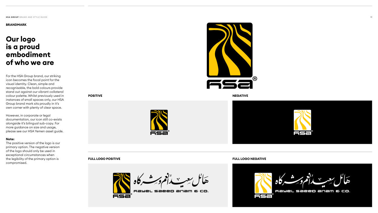
Read page text
H SA G RO U P B R A N D A N D ST Y L E G U I D E                                                                                                                                                                                                                                                                                                                                                                                                                                                                                                                                                1 1

BRANDMARK

Our logo
is a proud
embodiment
of who we are


For the HSA Group brand, our striking
icon becomes the focal point for the
visual identity. Clean, simple and
recognisable, the bold colours provide
stand out against our vibrant collateral
colour palette. Whilst previously used in              POSITIVE                                                                  NEGATIVE
instances of small spaces only, our HSA
Group brand mark sits proudly in it’s
own corner with plenty of clear space.

However, in corporate or legal
documentation, our icon still co-exists
alongside it’s bilingual sub-copy. For
more guidance on size and usage,
please see our HSA Yemen asset guide.

Note:
The positive version of the logo is our
primary option. The negative version
of the logo should only be used in
exceptional circumstances when
the legibility of the primary option is                FULL LOGO POSITIVE                                                            FULL LOGO NEGATIVE
compromised.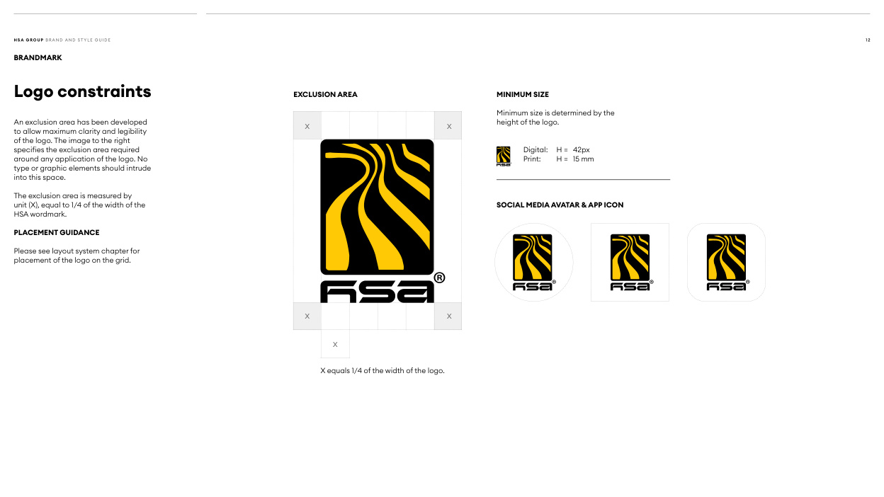
Read page text
H SA G RO U P B R A N D A N D ST Y L E G U I D E                                                                                                                                                                                                                                                                                                                                                                                                                                                                                                                                               1 2

BRANDMARK


                                                           EXCLUSION AREA                            MINIMUM SIZELogo constraints

                                                                                                           Minimum size is determined by the
An exclusion area has been developed                                                                                               height of the logo.
                                                               X                              Xto allow maximum clarity and legibility
of the logo. The image to the right
specifies the exclusion area required                                                                                                                             Digital:  H = 42px
around any application of the logo. No                                                                                                                                Print:   H =  15 mm
type or graphic elements should intrude
into this space.

The exclusion area is measured by
unit (X), equal to 1/4 of the width of the                                                                           SOCIAL MEDIA AVATAR & APP ICON
HSA wordmark.

PLACEMENT GUIDANCE

Please see layout system chapter for
placement of the logo on the grid.


                                                               X                              X


                                                                     X


                                                               X equals 1/4 of the width of the logo.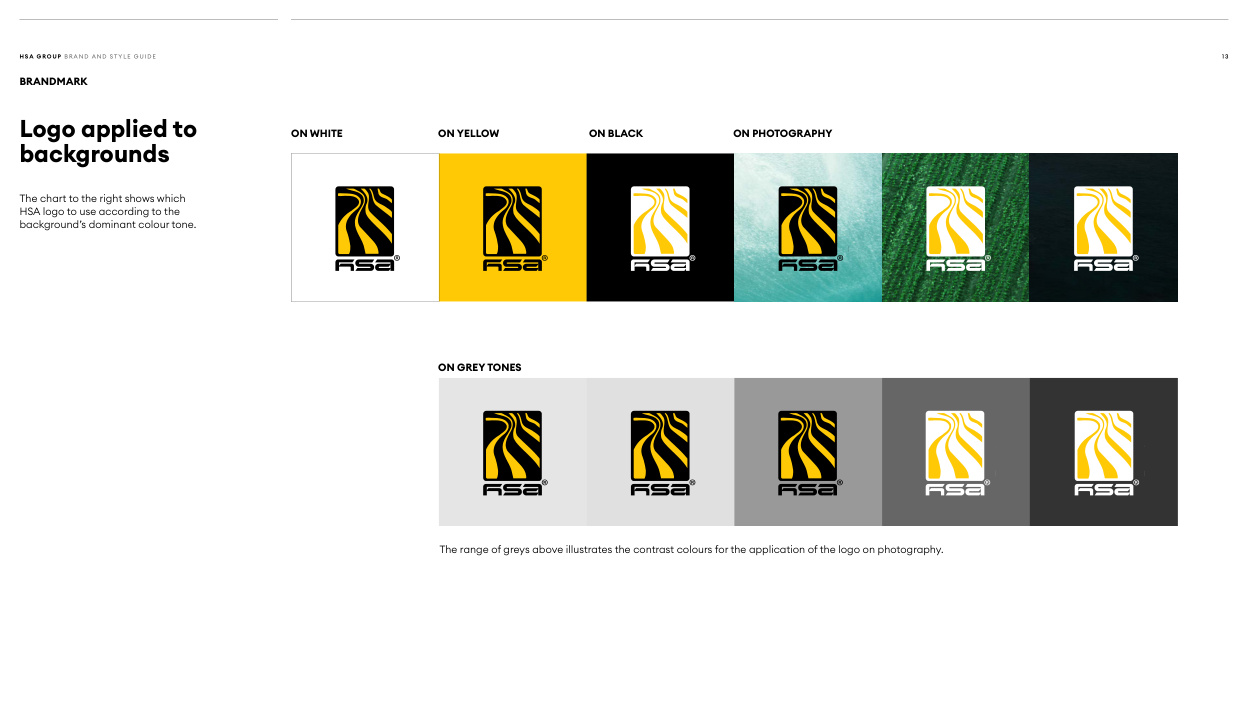
Read page text
H SA G RO U P B R A N D A N D ST Y L E G U I D E                                                                                                                                                                                                                                                                                                                                                                                                                                                                                                                                               1 3

BRANDMARK


                                 ON WHITE           ON YELLOW           ON BLACK           ON PHOTOGRAPHYLogo applied to
backgrounds


The chart to the right shows which
HSA logo to use according to the
background’s dominant colour tone.


                                                  ON GREY TONES


                                                                      The range of greys above illustrates the contrast colours for the application of the logo on photography.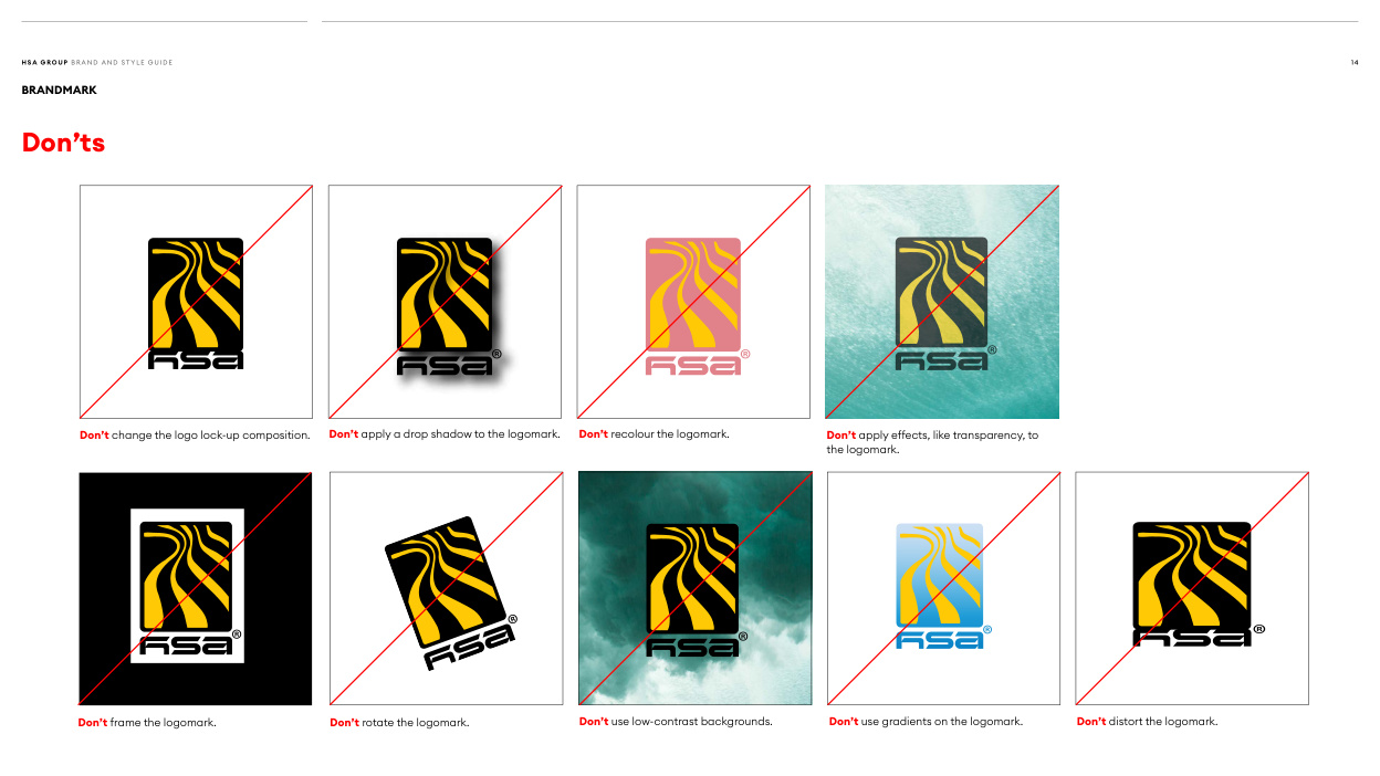
Read page text
H SA G RO U P B R A N D A N D ST Y L E G U I D E                                                                                                                                                                                                                                                                                                                                                                                                                                                                                                                                               1 4

BRANDMARK

Don’ts


          Don’t change the logo lock-up composition.   Don’t apply a drop shadow to the logomark.   Don’t recolour the logomark.                 Don’t apply effects, like transparency, to
                                                                                                                                              the logomark.


          Don’t frame the logomark.                   Don’t rotate the logomark.                   Don’t use low-contrast backgrounds.          Don’t use gradients on the logomark.         Don’t distort the logomark.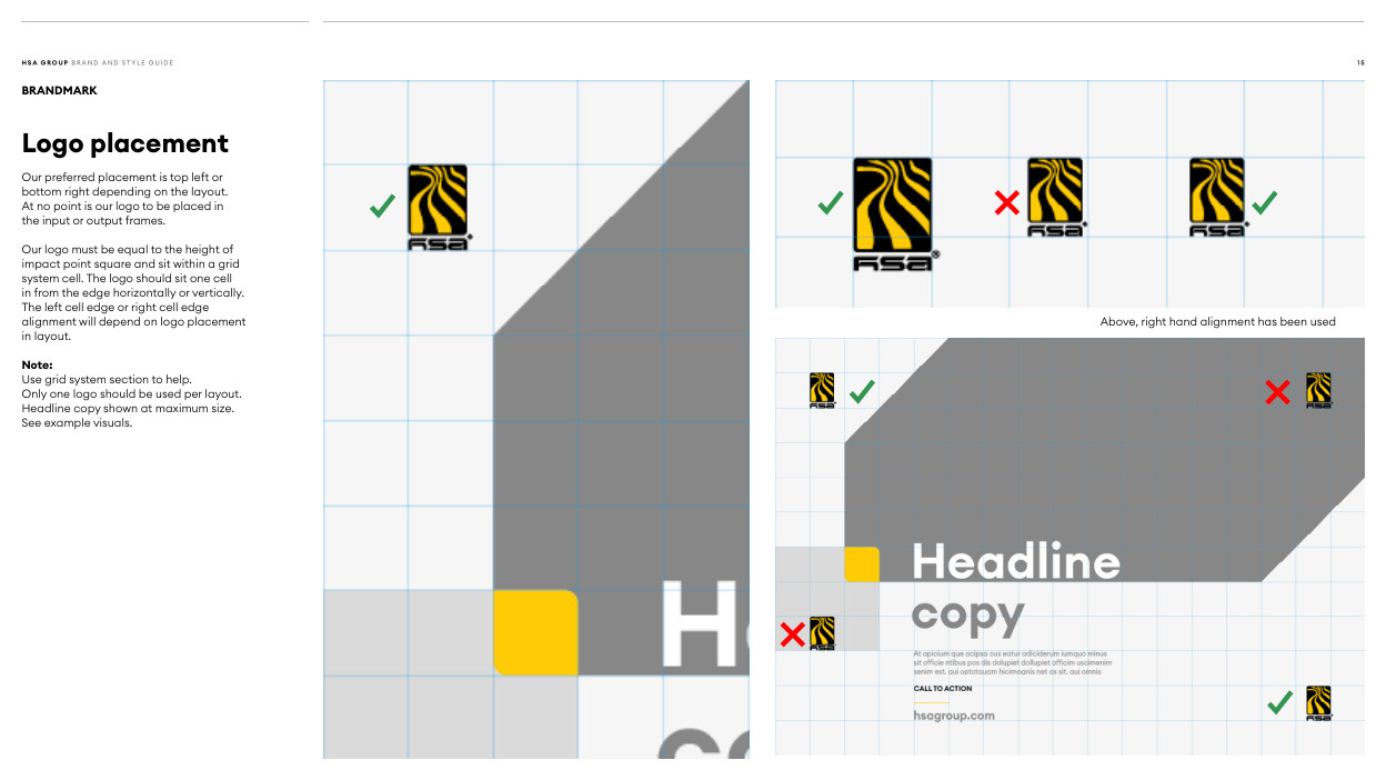
Read page text
H SA G RO U P B R A N D A N D ST Y L E G U I D E                                                                                                                                                                                                                                                                                                                                                                                                                                                                                                                                               1 5

BRANDMARK

Logo placement

Our preferred placement is top left or
bottom right depending on the layout.
At no point is our logo to be placed in
the input or output frames.

Our logo must be equal to the height of
impact point square and sit within a grid
system cell. The logo should sit one cell
in from the edge horizontally or vertically.
The left cell edge or right cell edge
alignment will depend on logo placement                                                                                                                                       Above, right hand alignment has been used
in layout.

Note:
Use grid system section to help.
Only one logo should be used per layout.
Headline copy shown at maximum size.
See example visuals.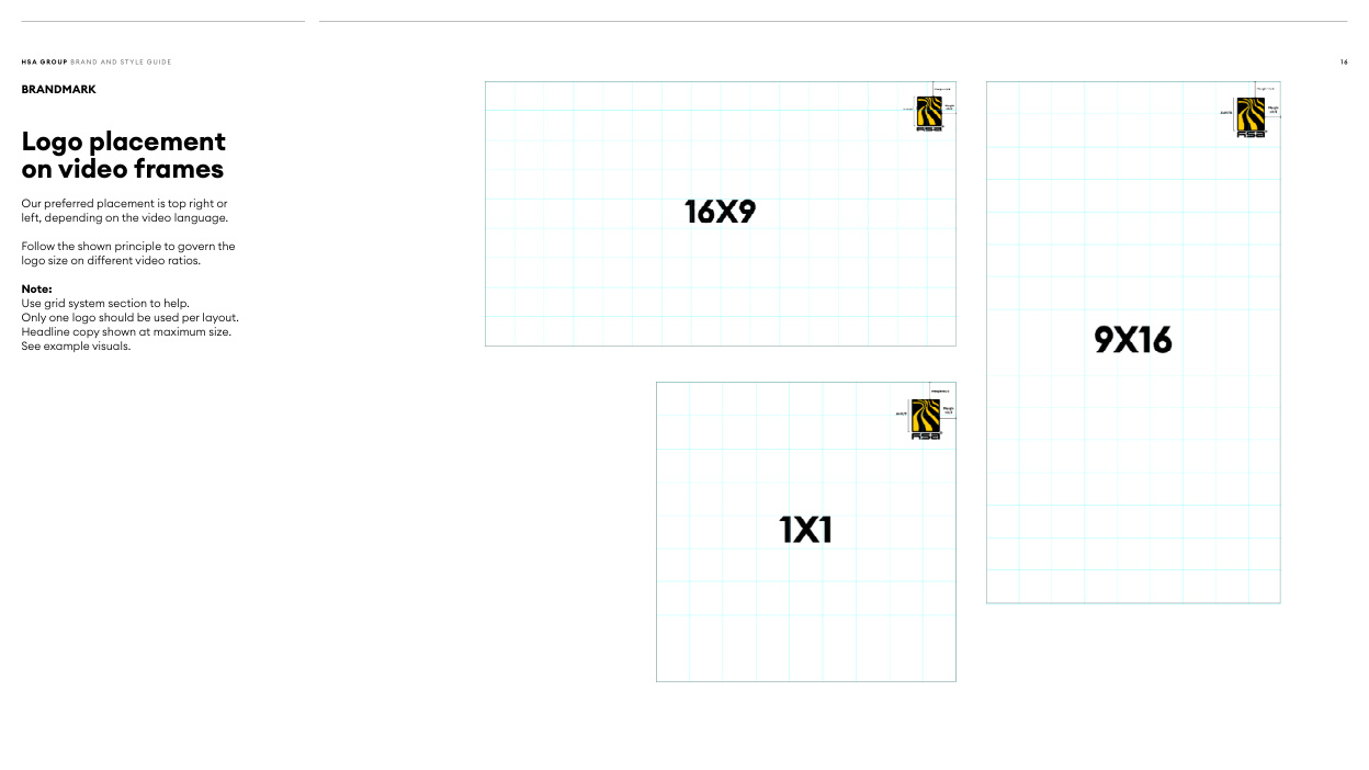
Read page text
H SA G RO U P B R A N D A N D ST Y L E G U I D E                                                                                                                                                                                                                                                                                                                                                                                                                                                                                                                                               1 6

BRANDMARK

Logo placement
on video frames

Our preferred placement is top right or
left, depending on the video language.

Follow the shown principle to govern the
logo size on different video ratios.

Note:
Use grid system section to help.
Only one logo should be used per layout.
Headline copy shown at maximum size.
See example visuals.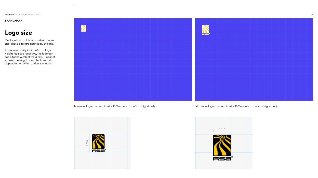
Read page text
H SA G RO U P B R A N D A N D ST Y L E G U I D E                                                                                                                                                                                                                                                                                                                                                                                                                                                                                                                                               1 7

BRANDMARK

Logo size

Our logo has a minimum and maximum
size. These sizes are defined by the grid.

In the eventuality that the Y axis logo
height feels too recessive, the logo can
scale to the width of the X axis. It cannot
exceed the height or width of one cell
depending on which option is chosen.


                                           Minimum logo size permitted is 100% scale of the Y axis (grid cell).                       Maximum logo size permitted is 100% scale of the X axis (grid cell).


                                                                                                                                                                 X AXIS


                                                                                                                                AXIS
                                Y